Music and Visuals: An Unrelated Analysis
March 2, 2023
When you think of sound, what comes to mind? Really: take a moment to think of the concept of sound and see what associations you make.
Now that you’ve done that, I would be willing to bet that many of you had some imagery come to mind, some sort of mental image of something that could be seen. It makes sense that it would be this way and that we would connect the sensation of sound with the sensation of sight; after all, most people see things that make sound and therefore associate similar sounds to those sorts of things. Sound can also be related to touching, as we know what sort of physical textures might lead to certain sonic textures. The interesting thing is, sounds are really separate in how we experience them from things we see or feel, and what’s more, we now have sounds that are completely digital, that have no real-world origin, and we continue to use the same language to describe them, even making new visual associations with them.
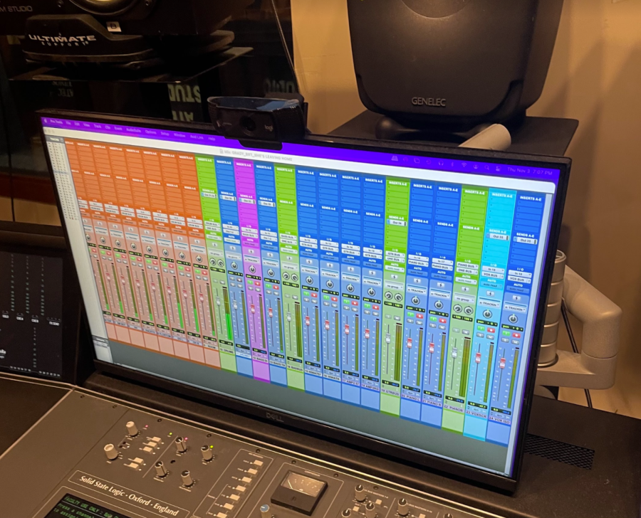
I personally still think of sounds as relating to visuals even when it makes little sense: to me, percussive elements are red, bass are dark blue or purple, guitars and leads are yellow or orange, melodic elements are green, and vocals are lighter blue. It doesn’t take synesthesia to associate sounds, and even genres, with colors either- it seems preposterous to suggest associating most metal with anything other than black and bright red, or hyperpop music with anything other than the brightest of neons. Of course, this has something to do with the tradition of album art that surrounds certain genres, as well as traditional association of certain emotions with certain colors. These emotions are generally tied to the themes of songs and even genres, so representing them visual works given our existing associations of color with feeling.
This color-coding can also be an opportunity to understand how seriously a song or genre might take itself. Pop and dance album covers tend to be very bright, sometimes even glowing, while songs in folk, rap, and rock tend to be more muted in color; when songs have more muted cover art, they also seem more muted sonically and more serious thematically. To be honest, it all seems obvious when stated. Personally though, the sway that the visual element of sound has over how it is perceived was surprising when I took time to think about it. The visual certainly helps in marketing, where easy signifiers of tone can be conveyed through color. This seems troublingly insidious to me though: how much of our taste is determined by visual associations that we might have very little conscious control over?
Ok but that skepticism seems a little much on second thought. The way visuals impact our perception of sound is worth thinking about and perhaps being wary of, but I’m also glad that we can draw such connections. Music should be appreciated on its own, but it also cannot exist in a vacuum. Great album art, visualizers, and music videos tend to uplift songs rather than cheapen the final product. So perhaps we should not divorce sound from the other sensations but create new connections for the digital age of music, something that already feels like is in full swing with animation and content creation. We’ve reached the point where our music is based in a reality of our own creation, so why not break free of our traditional associations to see where our new senses take us?

